
PRODUCT: 2 YEAR ANNIVERSARY COLLECTION (BTS)
A #1 fan foam finger was last year's 1 year anniversary logo. It stood for a lot, our first fans, their first grassroots streetwear shopping experience, the first time we really felt like fans of our own company and obviously the first full year of brick and mortar eTcTacoma. This year's 2nd anniversary logo is just as significant. The double dynamite is a homage to our big homies business acumen inspiration The Hundreds. It's also symbolic of our relationship w/ RSWD - it was 9 years ago during the retail 2 year anniversary that Umi was brought aboard the HUGE ship and groomed to become captain. So there is deep sentimental value behind going back to RSWD for his own two year retail anniversary. The double dynamite logo mimics The Hundreds signature color palette and is available on multiple items.
Our Stacks graphic is sporty the layering of the letters is tradition Americana baseball and the letters themselves are block shaped and clean. We might start a little league team. The graphic was created with the jersey in mind and the hat because it's a chance for people to rep for the home team. Due to the Rainier's we love baseball and a jersey and hat combo is the perfect way to commemorate the 2 Years people have been holding us down.

2 YEAR DYNAMITE T (STRIPED NAVY/WHT) / STACKED ETC SNAPBACK (NAVY)
While designing thee Nude Beach graphic we asked ourselves what we want from the Summer. An ideal Summer dream is the sun, the sand, the ocean, pleasant company and privacy. The 907 Summer scene is all that minus cotton to cover the body. And that's what the Nude Beach T embodies. It's a look from our point of view and how we see things we close our eyes and build the scenario how we see fit. If we can't bring the vision to maturation failure may not be far way. Thick yams and a shapely figure in the Summer sun will always be the recipe for relaxation. There's only one commandment - no creeps.

NUDE BEACH T (BABY BLUE) SALMON (NOT PICTURED)
As a child In n Out was the worst. It was almost too fresh for such an immature and inexperienced palette. But after a decade hiatus from my first experience taste bud evolution lead me to the promised land. The secret menu converted me into a loyalist. It's the closest a burger experience has come to touching the nostalgia that is Frisko Freeze in every bite. And during design school when life upped the ante to expert it was the heavy comfort food that kept us grounded. Through the ups and downs In n Out saved a lot of hopeless nights so homage is in order and animal fries are forever.

UPS N DOWNS L/S (WHITE)
There are not very many airports that are as infamous as LAX and certainly none more identifiable. The LAX sign is easily top 5 Los Angeles landmarks. It's been photographed, filmed and replicated for art and design amongst other things. It's the first thing you see exiting the airport and entering LA and the last thing you'll remember on your departure. Up close it feels larger than life and has always been a part of the LA experience whether vaction or staying long term. Flipping the sign is about making our mark letting you know the two are synomous LA and eTc.
Champion has re-established it's place in the market over the past four years. In the early chapters of the streetwear bubble (before it's burst) it seemed every young brand wanted to the touch Champion as a means to help solidify their brand as official. And for some time it worked before becoming oversaturated and commonplace halting the over usage of the popular basics. But w/ mandatory 907 hoops happening every Sunday reminencing on comfort combined with functionality their version of the mesh short was the only plausible option next to our dynamite graphic.

TERMINAL T (NAVY) / 2 YEAR DYNAMITE SHORTS (NAVY)
Just like any other year 2016 was full of gains and losses. But one loss in particular struck a chord with not only us but with (what felt like) our entire nation. It's the end of an era - the Kobe era. For two decades he gave us passion, highlight reels and buckets upon buckets. He gave us some of the coolest basketball Adidas we will ever know. He gave us scandal and a bounce back - he gave us his all in the end. And this year he ended it. Kobe retired. There was no way we weren't paying tribute. The Black Mamba moniker was always so epic it made seem like a comic book super hero. So that's where you get the fight scene dynamic in the graphic. Shouts to Kev for his amazing art direction.

MAMBA SNAPBACK / 2 YEAR DYNAMITE T (BLACK)

MAMBA TRIBUTE T (BLACK)
We will forever flip the Dome. The Dome means home and home means relaxing but also taking your time to be a task master about everything you do because the environment provides that opportunity. It's a symbol of our lifestyle somehow because of how much it means to Tacoma. This time we literally flipped it upside to show our version of chilling in its most ideal form during Summer which includes with a pool and the sun and some palms trees (imported from Nevada) at the same time tossing in our Club907 inner-tube graphic.

POOL BOY T (WHITE)
The off take take out T was inspired by Tim Wistrom. He does the most amazing work and one of his pieces combined all these amazing elements of Seattle in such a vivid way. We were captivated. So when flipping the dome again to make sure there is heavy Tacoma reference in our 2 year collection we decided to intensify the scenario. Earth is in dissaray, Tacoma is buried in the sand, it's time to leave but you can't leave behind the essentials, we need that comfort food when all else is lost. Fish House and Frisko that what we'll live off, until we all die from heart attacks after only a decade. It's a sad ending but what a sweet life. Our version is waaay more left then Tim's but he ignited our imagination, that's the mark of a great artist.

TAKE OFF TAKE OUT T (WHITE)
Since it's our 2 Year we did two drops one in LA and one in Tacoma. We had to hold it down for both sides and rounding out the baseball theme we let our shop manager Grayson, a former baseball player (and a nice one) develop the Dodger rip. He felt as though there was no logo more recognizable and for us it's about heritage and tradition and Dodger's as an organization are engrained in the culture. It’s like our relationship to the Rainiers so it felt right to do it even though we know so many others have in the past. A bit of West Coast heritage graphic maybe?
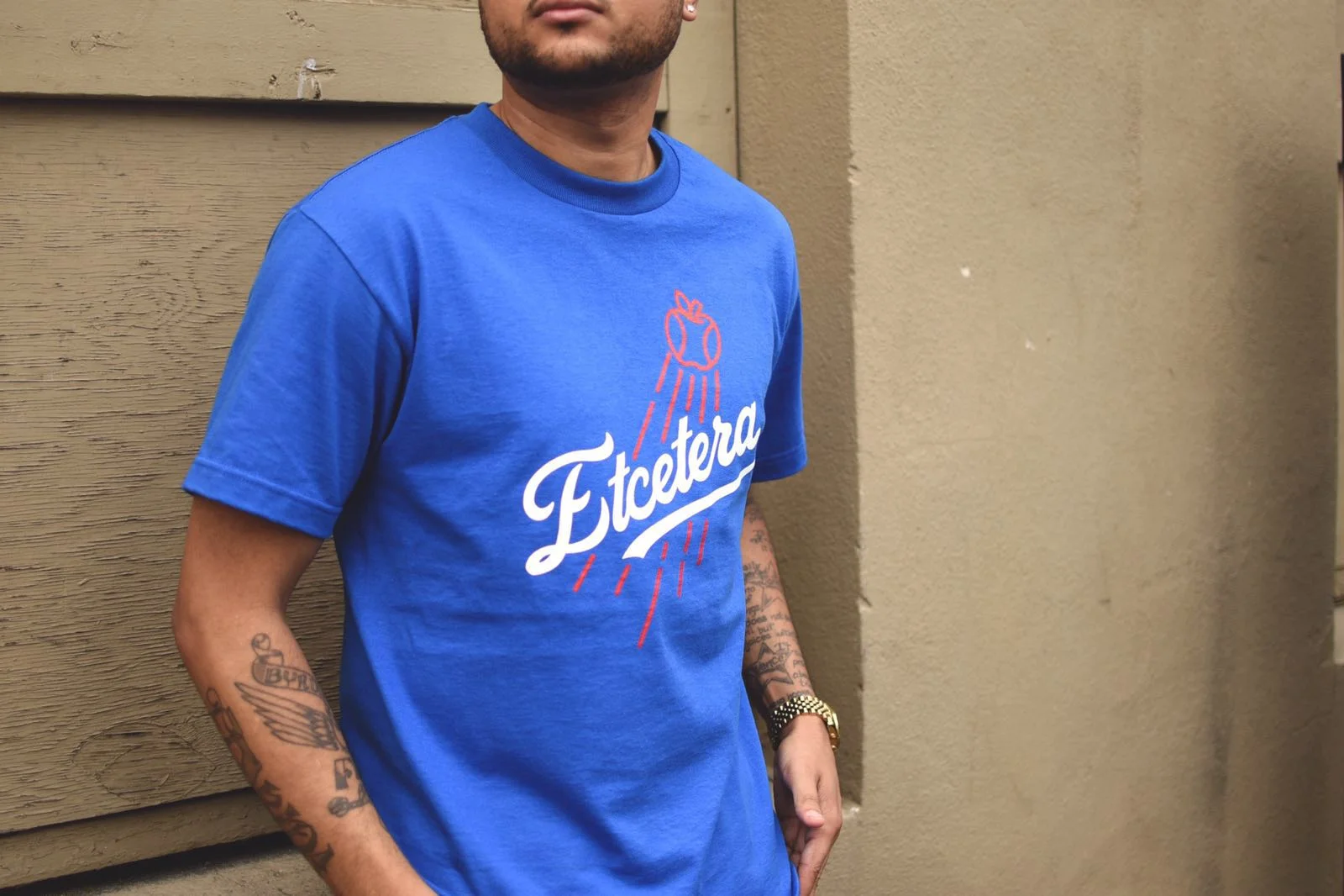
DODGE' EM T (ROYAL)
We used the Pool Boy concept to give point of reference to our inner tube graphic so you know that it is!! Because if we hadn't we would be plagued with the what's that question. But the inner tube graphic is another reference to our ideal Summer. Provide Summer sun and a pool, a lake, a mellow river, a large pond whatever and it can become 'Coolin Season' Vol. 3 immediately which eventual will lead to napping season. And a water nap is amazing. Try it (be safe though). We also enjoy jet-skis maybe that we will be Club907's logo next Summer.
